The Color Run 2016

While I can’t stop seeing, feeling thinking color, I can’t understand how I missed this amazing opportunity to be part of the Color Run a week ago. I am so disappointed!

That said, when I saw pictures and videos of the happy crowds at the event, I felt exhilarated. Dressed in all white, I imagined myself running into a riot of color and a wave of fun and happiness sweeping over. 

Even so, when I knew that my sister in law, Arshia and nephew, Faiz had participated, I was proud of their achievement.

A rush of vivid color combinations can have a heightened impact on the mind and spirit.  A liberating feeling, well….almost.  Called the “Happiest 5K on the planet”, those who take part have their own reasons to do so. 

What would you run for- to get initiated into running long distance if you are not, party in the midst of dance and music, color love, or just plain curiosity? Whatever your reasons are, you would end up energized and happy.

Either way, the idea of the Color Run is to encourage all of the above and more. But before this, it is first about creating awareness that color makes us happy.  What is awesome about the event is getting bathed in color as you run which intensifies the “happiness” experience. The degree I guess would vary from person to person.

The next Color Run is on 25th March 2017, Abu Dhabi. This time I have put a reminder on my phone. Would you like to join me?
My Spa Special

My experience at The Barai at Hua Hin, Thailand was out of this world. I felt rejuvenated in its natural surroundings and structural beauty of the vast property.

Built to fulfill the personal wellness purpose, The Barai Resort Spa is a sanctum with its luxurious suites and treatment rooms. It was in these treatment rooms, that I felt more special and spoilt. Each day was one of its kinds where a new pair of hands worked towards exclusive care and attention. After the first day, there was more to “The Spa Special” (TSS) that struck me.

As I walked the passage to the Salarai or open pavilions to reach the treatment room, I felt the calm and serenity of the temple like structure under the open sky. The earthy colors gave a sense of being grounded. 

While the dim lighting in the treatment room offset the gold and pinkish red, daylight seeped in through multi colored star- shaped glass pieces set into a wooden door. This visual treat uplifted my mood and I relaxed even more.  I was sensing every moment in that room. The width of the space was more than comfortable for a single person; somehow the tall ceilings added to the mood. I realized that individual space was more important than being alone in a large room. 

The total experience made the Spa special. Not just the treatment but also the right mood created by colors, design, and lighting, most of all its quiet beauty and space.

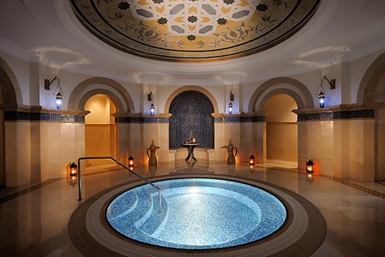
Let's take a look at the spa at the Hilton Jumeirah, Dubai. Don’t you think it has some things in common with TSS?

Here’s a nondescript treatment place in Deira Dubai. Uncanny how this Ayurvedic massage center makes me feel as though a wave of calmness has swept through.  For sure, it’s those earthy colors and beautiful lighting!

Look at this modern spa in The Address Boulevard, a five star hotel in Dubai. Would this be your private spot for an hour or two?  Does the off white with wood and tall windows create a tranquil ambiance? 

Add the element of luxury to warm colors and perfect lighting and you get the Cleopatra Spa in Wafi Mall Dubai.  Would this work for you?  

Opulence is a feature of some reputed hotels in Dubai. The Rixos Royal Spa below is a work of art yet does it serve the purpose of TSS?


Neutrals and dark wood with orange create an harmonious environment at the Dubai Ladies Club Spa Earthy and vibrant hues together make for a calm and energized effect in this treatment enclave.

Grandiose v/s Unpretentious. What would your Spa choice be?

Are colors fashionable?

A flying start to my holiday a couple weeks ago was frenzied packing. It was not one but two suitcases (for the first time) for two different trips: one for a getaway in Thailand and another for chilling time, if you like, with family back home.

After ten minutes of staring at the line-up in my wardrobe, I pulled out my new Marsala dresses. I was so happy looking at the color of these dresses that I imagined feeling great when I wear them.

Fashion is contagious. Every time I see trendy outfits or shoes I want them.  Telling myself to be discerning is the only way such compelling moments fizzle out. The rationale behind this is that fashion is about personal style; it’s what makes us feel and look good. And color is integral to this equation.

Colors make your mood. In winter, a pink scarf could lift our spirits.  Don’t you love this attractive shade of pink to brighten up your neutrals?

White is regarded as a color of wholeness and perfection.  Wearing white (or off-white) at official meetings tends to convey a business like approach but also opens a way for creating anything the mind can perceive.  Just the perfect choice for Mrs. Hillary Clinton’s business suit at the recent presidential debate!

Purple is a color of leadership therefore a fabulous option for executive women. 

Via Pinterest, expresssurvey.com

While rich shades of purple merge with the beauty of fall, Vogue announces mauve and pink, glitter and red as the Fall/Winter trends for 2016-2017.   Gold metallic and shades of tan are New York Fashion Week’s perspectives for some top fall trends this year.  However at the end of the day, trends are just suggestions and whether we follow them is a matter of personal choice.

Would you match up any of these dark lipsticks below with your outfits this season? I would go straight up for the first four from the left. 

Yellow shoes are a hot favorite for any age. I love the striking color combinations here- dark blue black with yellow and electric blue with yellow. The pretty yellow bag caught my eye  as it completes the stylish look.

Via Pinterest / streetstyleseconds.com

Via Pinterest/shoes for women over 50

I have fallen in love with this cool fashionista’s sense of style and color coordination. Can’t miss four wonderful shades of blue paired with pale pink and highlighter green and pink! I can imagine teenagers who have flair for fashion would love this casual yet well-turned out gear.

Laura Capon, a fashion and beauty writer talks about teenage fashion in her recent article. Velvet is the trend this winter for older teenagers. They can wear any style in burgundy, pink, nude, tan and black.

Source: Laura Capon/Sugarscape

So it looks like fashion and color is all encompassing this fall and winter 2016.  Now, this makes me even more of an ardent follower of Pantone, my Color Guru. I would be inclined to wear any of the top 10 colors in Pantone’s fashion color report for fall 2016.

The delight of food

I am not a foodie nor do I enjoy cooking everyday. (I can almost hear you saying “Really? No way!”) But here’s the good part - the few times that I cook, I do it with great love and care. Feelings overtake the notion that it is an unending, time-consuming chore.  The second good thing is the joy I experience when I color coordinate the repertoire for family or guests. This is what makes me jump into the process. I organize things quickly and slip into cooking with all my heart and attention.

Color makes food appealing and whets the appetite as against immaculate presentation that makes it look like a piece of art.  For instance, would you try the salad below?

Lana Grass

Or would you go for this one? 

Source unknown, www.pexels.com

I think you know what the answer is J.

I would snack on peanuts, butter is welcome anytime and can do jelly on toast before the actual breakfast.  But peanut butter on its own or with jelly is forever on top of my “never to do” list. I would not contemplate it in the hungriest moments.

The peanut butter and jelly sandwich below turned me around. I was drooling in seconds and almost dashed to the kitchen!  No doubt it is a delicious looking shot, yet I can well attribute my change of heart to the power of colors here. 

I believe people finish everything on their plate at A Gianni. This no frills restaurant in Barcelona is well known for its fabulous Italian food.  You want to go for the meal as soon as it arrives; yet you catch a moment to notice the balance of color in every dish on the table. Isn’t that amazing?

The ability to appeal (or not appeal) belongs to colors and how well they are brought together.

Here’s a vendor in India who believes he can sell better than others in his group through a creative display of rice and lentils. What would you do if were passing by and could do with some restocking?

In India, the fantastic flavors of food come from its spices. Spices give flavor, aroma and color to the food. 

You can juggle spices to make red, green or yellow curries -feel the warmth with a red one and freshness with the green. To cheer you up, try yellow. 

This one is for food lovers - Would it matter if your food has no color appeal? I might just try it out some time soon.

Sands of time: A color inspiration

It is a hot day in June and we are driving past the vast stretch of sand along the highway. As we go, deep dunes change color from cream or light beige to red brown in the interior of the country.

The splendor of The Arabian Desert lies in the interplay of colors. In reality, color has no physical existence. It can only exist in the presence of light and our perception of color is about personal experience.

In case you are unfamiliar, I want to share the desert’s beauty through the day and at night and how its resplendence can inspire some awesome color palettes for your living.

Here is the desert on a not so bright day.

Looks like the bedroom below has captured the colors of the calming landscape like magic. I love every single thing in it. The hues, texture and the design detail are arresting. I was never one for pairing black with pale pink, being high contrast colors.  But clever use of the combination here is pleasing to eye.

The desert against the setting sun is a feast for the eyes.  Don’t you love the gorgeous blend of colors?

The outdoor space below reflects the scenic splendor you just saw, in a unique way. Colors flowing from the flowerpots, wooden beams, tiled floor through to the fireplace find their home in the evening sky and desert.

I can imagine the striking blue and beige gold in a moonlit desert inspiring a lifestyle trend.

Do you love this amazing capture of the desert night in the corner below? The best part of this beautiful vignette is that it embraces warmth in spite of its rich blue accent and gold highlights. The refreshing green couch and the white chairs soften the plush appearance as it were forbidding aloofness among people sitting there.

Take a look at this entryway. Conspicuous hints of gold, a textured light brown cabinet, deep blue vase with a widespread plant make a statement in the backdrop of subtle white and grey, and pop of blue on the side. Though the color and design has a purpose, it has a timeless quality like the beauty of the desert at night.

If you are ready to do a color design for your home or office, it is well worth looking at your landscape for inspiration.