My Christmas Special

For various reasons, Christmas has been one of my best times of the year. The lights on the Christmas tree, Santa and “jingle bells” meant happiness and cheer and ushering the New Year with family and friends were moments I cherished.

This is the only occasion when I love seeing the combination of green, red, silver and gold. I realize now that it is the festive feeling that makes these colors look great together. Much as I am drawn to the beauty of Christmas, I am surprised and must admit that I have never owned anything that is a mix of red and green! 

Would you try out any of these color combinations for holiday style?

The colors of Christmas are a one time special - Green represents a time of healing while red stands for renewed strength.  

Today, I want to bring out the charm of red and green in the home, one that is unique to Christmas celebrations for billions of people around the world.

Decorating your home for Christmas should be simple and easy so that you can keep up the holiday spirit. What do you think of these DIY floating candle jars on your center table or dining table?

Now, can you imagine a snowman in the children’s bathroom? For sure, they would wash their hands more often than usual.

What do you think of transparent glass bottles to decorate the entryway…

….And mason jars for the kitchen?

Even so, the thought of gift-wrapping the door or the fridge is exquisite and a visual treat. What do you think of this?

While red, green and glitter is the Christmas tradition, green and grey against wood with pretty lighting can create rustic glam. 

Here’s an awesome idea to spruce up your white kitchen.

With the festive season round the corner, would you decorate your home in the traditional way or create your X’mas special?

Season's greetings! May 2017 bring you peace, health and happiness. 

Just Pink or Blue ?

In the early 2000s, I couldn’t imagine painting my kids’ rooms any other color but pink or blue. What's more is they wanted pink and blue. Their choices were a medium blue and pink and these colors seemed to impact their growing years. Blue instilled confidence and the pink enhanced sensitivity and care.

A decade later, a baby’s room is not just pink or blue; it’s colorful and fun. What do you think of this?

The idea is to create happiness with color and a space where the parents and child would enjoy spending a lot of time together.  While the nursery is a place created with love and sentiment, I am wary of bright colors and patterns.  They tend to be over-stimulating and make the room look busy when calm and quiet is much needed at the best of times.

Patterns like chevron in subdued colors would transform the room like magic. This well coordinated baby room is endearing. Don't you love it?

A livable space is not just about being stimulating. It needs to be safe, happy, warm, comfortable and enjoyable. Can you imagine playing with your baby for hours here?

Here the accent of pastel yellow stripes against soft green walls is fresh and cheerful and the pops of blue, red and orange brighten up the room.  And these colors work well for a baby boy or girl.

Touches of red in this blue and white room energize a toddler’s room. An appealing place, don’t you think?

Take a look a the space below. I love the deep blue accent wall with the rest of the bluish white.  Hints of lilac, gray, shades of bluish green and brown lend charm to this small place.  Would you use these colors for your baby girl’s nursery?

Last year a friend picked bluish grey and white for her baby boy’s room. Subtle use of colors in the accessories livened the room. The thought here was to create a space which the family could enjoy through the child’s growing years.

Looks like the rooms below support this thinking. Depending on how fast our kids grow up, we could make basic changes like changing picture frames and accessories and replacing stuffed toys with books shelves. 


livable space for grwoing years 2.jpg

Colors stretch the imagination and permit bold experimentation. Take a look at the pic below. Would you pick black and white for your baby’s room?  If so, why would you make this choice? 

Are dark colors dark?

While Benjamin Moore (BM) announced Simply White as the color of the year 2016, it is already talking about darker color trends much before the year ends. In fact BM’s color of the year 2017 is Shadow, a moody shade of purple and one of the 27 colors trending next year.

benpalette.jpg

With mysterious properties, Shadow seems as though it is meant for those who are not afraid of color changes as per the quality of light flowing into the room.

Lets look at this purple room in the afternoon light.....

….And now at sunset.

Dark colors for a living space have been discussed for a long time and after consistent research over the last few years they have earned their rightful place in our lives.  For example, Sherwin Williams advocated Exclusive Plum for the year 2014 and Pantone launched Marsala in 2015. 

Exclusive Plum

Exclusive Plum

Marsala

The idea is to create mood and drama with dark colors. They tend to give an impression that one is ready to experiment and go beyond the comfort zone of neutrals.

And the cherry on top is: dark colors make smaller rooms seem bigger, corners feel cozy and private and a not so well lit space, look stunning.  

Using white paint or neutrals in a small room or in a place that lacks light is going to make it look dull and sad. Would this all white bathroom work for you?

BM’s trending color palette is a combination of earthy hues and dark colors. Pair the dark colors with neutrals and you get some attractive matches to suit your style and home. Color trends lend perspective and open up our mind and what matters is picking the color that makes us feel happy, energized and comfortable.

Would you paint dark colors for your room?

The Color Run 2016

While I can’t stop seeing, feeling thinking color, I can’t understand how I missed this amazing opportunity to be part of the Color Run a week ago. I am so disappointed!

That said, when I saw pictures and videos of the happy crowds at the event, I felt exhilarated. Dressed in all white, I imagined myself running into a riot of color and a wave of fun and happiness sweeping over. 

Even so, when I knew that my sister in law, Arshia and nephew, Faiz had participated, I was proud of their achievement.

A rush of vivid color combinations can have a heightened impact on the mind and spirit.  A liberating feeling, well….almost.  Called the “Happiest 5K on the planet”, those who take part have their own reasons to do so. 

What would you run for- to get initiated into running long distance if you are not, party in the midst of dance and music, color love, or just plain curiosity? Whatever your reasons are, you would end up energized and happy.

Either way, the idea of the Color Run is to encourage all of the above and more. But before this, it is first about creating awareness that color makes us happy.  What is awesome about the event is getting bathed in color as you run which intensifies the “happiness” experience. The degree I guess would vary from person to person.

The next Color Run is on 25th March 2017, Abu Dhabi. This time I have put a reminder on my phone. Would you like to join me?

My Spa Special

My experience at The Barai at Hua Hin, Thailand was out of this world. I felt rejuvenated in its natural surroundings and structural beauty of the vast property.

Built to fulfill the personal wellness purpose, The Barai Resort Spa is a sanctum with its luxurious suites and treatment rooms. It was in these treatment rooms, that I felt more special and spoilt. Each day was one of its kinds where a new pair of hands worked towards exclusive care and attention. After the first day, there was more to “The Spa Special” (TSS) that struck me.

As I walked the passage to the Salarai or open pavilions to reach the treatment room, I felt the calm and serenity of the temple like structure under the open sky. The earthy colors gave a sense of being grounded. 

While the dim lighting in the treatment room offset the gold and pinkish red, daylight seeped in through multi colored star- shaped glass pieces set into a wooden door. This visual treat uplifted my mood and I relaxed even more.  I was sensing every moment in that room. The width of the space was more than comfortable for a single person; somehow the tall ceilings added to the mood. I realized that individual space was more important than being alone in a large room. 

The total experience made the Spa special. Not just the treatment but also the right mood created by colors, design, and lighting, most of all its quiet beauty and space.

Let's take a look at the spa at the Hilton Jumeirah, Dubai. Don’t you think it has some things in common with TSS?

Here’s a nondescript treatment place in Deira Dubai. Uncanny how this Ayurvedic massage center makes me feel as though a wave of calmness has swept through.  For sure, it’s those earthy colors and beautiful lighting!

Look at this modern spa in The Address Boulevard, a five star hotel in Dubai. Would this be your private spot for an hour or two?  Does the off white with wood and tall windows create a tranquil ambiance? 

Add the element of luxury to warm colors and perfect lighting and you get the Cleopatra Spa in Wafi Mall Dubai.  Would this work for you?  

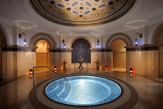
Opulence is a feature of some reputed hotels in Dubai. The Rixos Royal Spa below is a work of art yet does it serve the purpose of TSS?


Neutrals and dark wood with orange create an harmonious environment at the Dubai Ladies Club Spa Earthy and vibrant hues together make for a calm and energized effect in this treatment enclave.

Grandiose v/s Unpretentious. What would your Spa choice be?