
At a Wellness event, I spoke about color and its importance to our lives and general well-being. Whether we are aware of it or not, color plays a huge role in our lives. From the clothes we wear in the morning, to the foods we buy, to the brands we reach for in the pharmacy, color is influencing us.
I grew up imagining and feeling color as if it was essential to life. At times it had a deep impact and I did not know why.
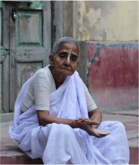
I was 3 or 4 years old when I saw my great grandmother. I still remember her as a fair complexioned, quiet lady who always wore a deep maroon sari. As I grew up, I understood that widows in our family at that time wore this color. This was one color that I disliked since I was 10 or 12 years old. For decades after, I stayed away from maroon. I imagined it as a serious, boring and unpleasant color that made me feel dull and sad. In my ripe years, I realized that cultural influence on color could be intense.
Research shows that maroon stands for sacrifice and bravery. For example, red is stimulating, evokes passion and represents danger.
Tibetan monks wear red or maroon robes because it symbolizes deflecting attention from yourself and allows you to focus on compassion and kindness towards others.
This is called the “psychology” of color or ways in which color determines human behavior and influences our perceptions that are not obvious. These influences on the mind are strong but our “color impressions” i.e. likes and dislikes override them. Per se, our personal relationship with color takes over.
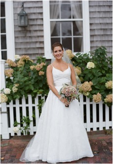
Yet color has a magical quality. It can sway your thinking. When Pantone declared Marsala as the color of the year 2015, I rediscovered maroon. Marsala is a lively, rich, warm, captivating color.
I love wearing Marsala. It makes me feel happy and confident and I want to experiment with it.


It also lends character in my home.
Colors can have positive and negative effects. Bright yellow painted in large areas is irritating to the eyes while light yellow is comforting and cheerful.
Just like we have different reactions to color, cultures across the world have their own expressions for color. For example white is a symbol of death and mourning in China and India while it is a symbol of purity in the western world.
Culture is important to consider when we talk about color. Colors that are descriptive such as light blue, pale yellow, forest green, are heavily influenced by region, culture, age and sex.
Every country has its color descriptors. The Chinese have pure descriptors as opposed to the Americans. For the Chinese, blue-green is green because they do not know the word blue-green.
Color also influences our appetite. Apart from blueberries, blue and purple potatoes, can you imagine eating a blue apple?
Appealing colors like red, green, yellow, orange appeal to the appetite. Green leafy vegetables mean good health and nutrition. Burgundy encourages slow dining while bright colors are used in fast food restaurants to speed up meals.
Colors also affect taste, smell and hearing. Bright yellow means tangy, hot and noisy, pink is sweetness, soft to touch and muted in sound, grey evokes the smell of smoke and grass green incites a smell of freshness.
Color is also used to make medication. It communicates reliable pain relief so a good reason why heartburn pills are not red and those for nausea are not muddy green!
Not only is color is important to our food, clothing and medicine, it is important in our home. The colors we pick for decorating our home influence our overall wellbeing. It is all about bringing the house and the people in it, in harmony with the external environment; this makes the home comfortable, nurturing and protected.
The kitchen is usually a warm, cozy, friendly and social place; What colors would you use?
Bathroom colors can sometimes be tricky. We need to be careful with the use of green and yellow; bright greens and yellows can make us sick!
It is important to consider the age and health of family members in the home when making color choices. The Aged see yellow, red and orange more easily than other colors.
Blue is calming but if you don’t like blue then it should not be used.
In the workspace too, color should be used meaningfully. Proper use of colors can maximize productivity, decrease fatigue, and relax the body. A bright yellow wall behind a workstation along with glare from the screen will cause eye fatigue. A workstation placed on a white work surface has a similar effect. Dull drab colors, harsh fluorescent lighting and reflective wall color cause low productivity, reduced morale and physical illness.
Today people seek mindfulness and well-being as a solution to life’s stresses and colors that fulfill our need for reassurance and security become important. Pantone’s color choices for the year 2016, Rose Quartz and Serenity embody this. The colors reflect connection and wellness as well as a soothing sense of order and peace.
Color enriches our lives. When our experiences with color are visually appealing, energizing, happy and give us peace, comfort and security, we can achieve a heightened sense of well-being.